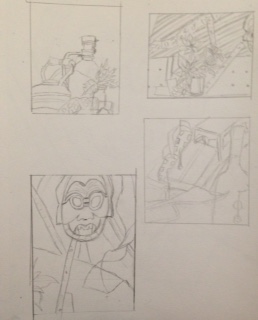
For the final studies I did four different sketches on four different views of the life still. Then I took my favorite sketch out of the four and made a final sketch for it.
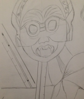
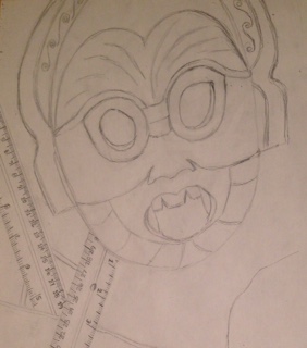
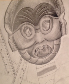
These are some pictures that show the progression of my still life. I started off with the outline and then began on the mask since it was the most detailed. 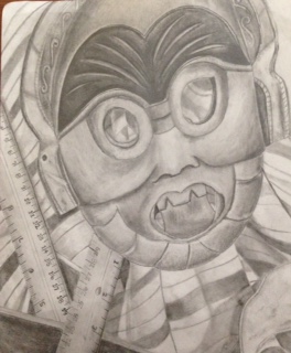 I think my still life drawing looks clean and well blended. In this piece I think my values and shadows make the piece look realistic. I think I used a wide range of values that go from the darkest value to white for the highlights. The values of a piece of work are very important. They help distinguish the shadows and highlights of the piece making it look realistic. The contrast of the white for the highlights and the darker values for the shading create the illusion of depth making it three dimensional. The source of lighting in this piece is from above. Because the light source came from above, there are more highlights in the center of the mask. The compositional sketches played a big role in this piece by helping me decide which view to pick from and it helped with helping me sketch out my final drawing. I think my final drawing is successful in how three dimensional it turned out with the use of shadows around the objects as well as range of values used in the piece. Proportion wise I think I made the mask appear longer than it did and i made the rulers appear larger. Structure wise I think turned out good. I think the items drawn are how they were on the actual still life. The perspective of this piece was seen from a front view angle so that is why the objects are not seen from the sides or tilted. I think that the composition of this overall piece is pleasing since it doesn't overwhelm the eye with a lot of objects. The center of interest would be the mask. I think the mask is well located since it is not right in the middle of the drawing so that the other objects are seen around. I think I could improve on my time management better. I feel like I took most of my time working on the mask and making it look realistic rather than completing it and then going back to add final touches. One challenge that I had to take on was adding darker values. I feel like usually when I work with pencil I tend to use a lot of light and medium values, but because of the darkness of the mask itself, it forced me to use darker values in certain areas. From this drawing I have learned to pay closer attention to the details of objects like texture and values as well as with the proportions of each object.
0 Comments
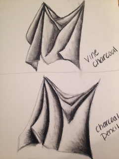 For this study we had to draw and shade fabric using vine charcoal and charcoal pencil. I found that it is easier to use both vine and the charcoal pencil to create a better value scale since the vine charcoal doesn't go that dark. I also found out that using a white charcoal pencil helps to better show where the light is hitting the fabric. 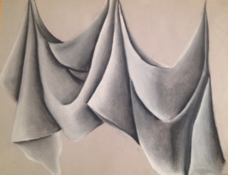 For this final fabric drawing, I think i used a wide range of colors from the value scale. I say this because i tried to use the charcoal pencil where the folds are to make it look darker and then i went back with the vine charcoal to show the gradation to the white where i used the white charcoal pencil to define where the light is hitting. My knowledge to the value practices helped me in this piece by getting a better idea of the value chart. It taught me to go from only using a white background for drawing shadows to learning how to draw using a black background. I think that i did a good job with the transitions from dark to light in showing more than two values and making it look smooth. In the darker spots i used a lot more pressure with the vine charcoal and then going a little darker on the edge with the charcoal pencil. Towards the middle i used less pressure and blended that out. For the highlights i used more pressure with the white charcoal pencil on the outer edges where the light would hit more and then putting less pressure towards the center and fading it out to the lighter gray. The interpretation of texture is essential for this piece in showing the folds of the fabric as well as the smoothness of the sheets. If i were to recreate this piece i would probably go back and darken up some places where the folds meet. I would also make it with more wrinkles on the fabric so that it gets a more realistic look.
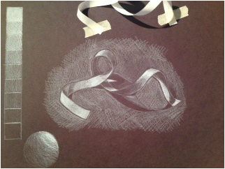 For this drawing we had to draw a ribbon using only a white prismacolor pencil on black paper. On the left of my drawing i started off by creating a value scale from white to black. I also practiced by trying to shade in a sphere. This was harder to do than regular pencil because i had to work backwards. Instead of having to draw the dark parts like the shadows, i had to draw in all the white i saw and use the paper for the shadows. For the shadow on the table, i decided to do cross hatching around the ribbon and shadow so that it would contrast the shadow better on the paper.
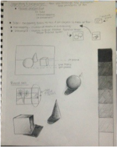 For this Value Studies I drew examples of showing value though a scale and through three- dimensional shapes. I also showed an example of placement, overlapping, and rule of thirds. 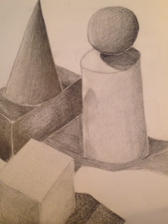 For the value final we had to arrange five different shapes on the table and then draw them using shading. For this piece i found it difficult to shade the more flat areas like on the rectangle and the square, than it was for the ball and the cone. i tried to show the shadows on the cylinder and square with a lighter value scale since the actual figure was white as compared to the rectangle, cone, and circle which were black.
 final contour room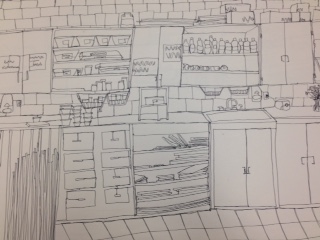 For this contour drawing we were told to draw a classroom. I think that my contour drawing uses fluid lines because you can see that the lines don't look sketchy and are not drawn over repeatedly. My knowledge with contour drawing contributed to this piece by learning to draw at the speed of my eyes and to pay more attention to the details. The blind contour practices helped me in slowing down the pace in which i draw so that I would be able to get my proportions right without the need to keep looking at my paper. The modified contour practices helped me in this piece by paying more attention to the details found in objects that I wouldn't have seen otherwise. The difference between an outline drawing and this contour drawing is that contour drawings depict the details inside the object while an outline is mostly focused on the outermost form of an object. The interpretation of line in this piece is essential for capturing the look of the classroom because it helps give details to the room as well as some dimension. From completing this piece I learned how to pay more attention to the details . If I were to recreate this piece again, I would definitely slow down and pay attention to the proportions since there are some items i drew that came out smaller than what they are supposed to be.
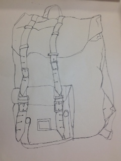 for this modified contour drawing we had to draw a life size backpack using one continuous line making sure not to lift up the pencil from the paper. i think that i should have done more details to the backpack like where it folds or wrinkles.
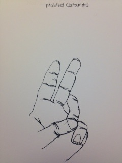 for my first modified contour drawing I think it looks okay. I still feel like I need to work on my proportions. I also feel like I need to work on making it look not so sketchy and make it as one continuous line. modified contour #2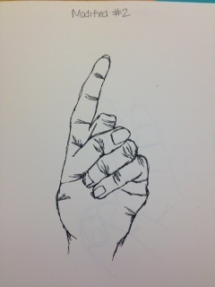 for the second modified contour drawing I think I did a better job proportion wise but I still need to work on not sketching it.
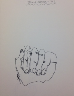 For this sketch we had to draw our hand without being able to look at what it is we are drawing. One thing that I need to work on is slowing down so that the proportion of the hand looks better. second best blind contour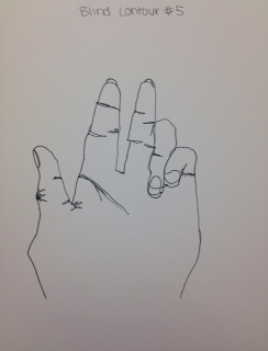 I chose this blind contour as my second best because I think the proportions of the fingers look better than the other drawings that I did. I feel like I still need to work on my pace to get a better drawing.
|
AuthorWrite something about yourself. No need to be fancy, just an overview. Archives
January 2017
Categories |
 RSS Feed
