|
Throughout my years in art classes, i have improved dramatically this year. I have gone out of my comfort zone in trying color, something i wouldnt have ever thought i would do and really enjoy. I have only ever drawn in graphite before this year and i have gotten to really like using other mediums such as paint, pen and inks, chalk pastels, watercolor, charcoals and prismacolors. This class as well as drawing class has really helped me improve my techniques thanks to the practices we have done in the beginning of each unit. I have learned how to properly add highlights and shading, i have learned to better improve my values and to not be afraid to add in dark colors into my pieces, and i have also learned to add in colors that one my not see like blues and purples. Overall, these last few art classes have taught me so much and i hope to still continue to do art as i leave high school in hopes that i continue to improve.
0 Comments
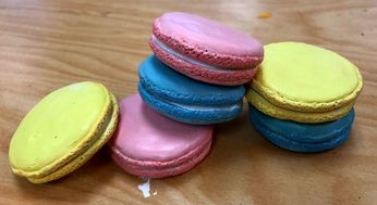
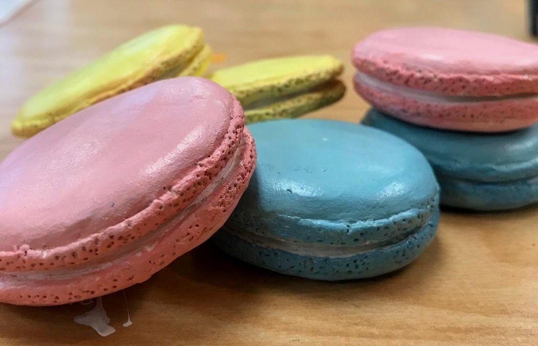
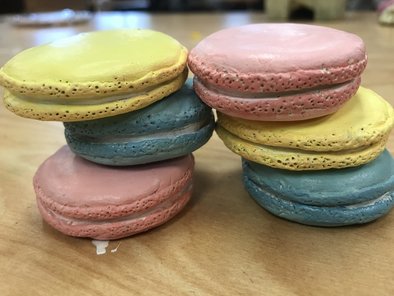
For this piece we were told to create a food sculpture with clay and then paint it to make it look as realistic as possible. For this project i decided to make macarons. I think that the craftsmanship of this sculpture could have been better. I feel that the painting was well executed. I tried to make the outside edges a little darker than the actual macaron which gave it more of a macaron look. The shape of some of the macarons is what i could have made better. They look more flat than what an actual macaron would look like and i feel like i could have prevented that or i could have have went back and fixed it. I think the most difficult part was making them all the same shape and size. I feel like the colors i chose worked well together in the pastel scheme i chose. I think that because of the different thicknesses of each, it makes it look interesting from different views when stacked together. The differences in creating a sculpture and creating a drawing is that in a sculpture you can somewhat rely on the texture of the actual sculpture when you paint but you cant do the same for something that is two dimensional. The texture in a sculpture can be created using different tools and can also be implied with color when painted using different values and highlights. I think that if i were to add more of an orange tint to it on the sides of each adding more color to it then maybe it would look more like the actual thing. If i were to do this project again i would make them more thicker than what they currently are. i would also maybe add some garnishes on top to make them look more detailed and more presentable.
sketches
in progress...
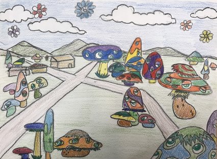
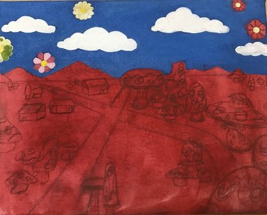
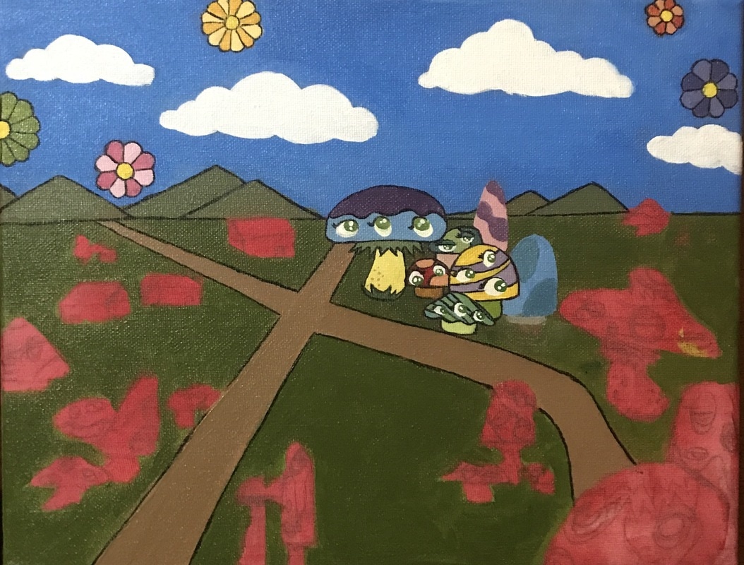
final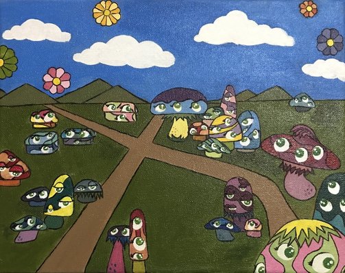 For this project we were told to pick an artist out of two and research their style to create a landscape painting using their style. The artist I decided on is Takashi Murakami, a Japanese contemporary artist. One technique i used to make this piece successful in his style is the use of bright colors. He uses bold colors to make his paintings stand out so i thought i could use that in this piece. Another idea i used is incorporating his signature mushroom characters. I decided to create my own mushrooms in his style. Third, i incorporated his style in outlining the characters in black so that they appear bold. I decided not to outline the clouds because in his painting "Vapor Trail", he did not outline them and that's the other idea i incorporated in this painting. I think the craftsmanship in this piece was well executed. I tried to neatly outline everything and i tried to clean up some areas that didn't look clean. The most difficult part of this project was trying to determine which colors worked together for each individual mushroom and deciding the colors to make so that the colors wouldn't repeat too frequently. This style reflects my artist because i found a way to incorporate two of his pieces into my landscape. If Takashi Murakami were to see this painting today i think it would make him smile because i'm finding inspiration from his pieces. I also feel like he would suggest for me to have made the mushrooms on the left differently using different forms. If i were to do this project again i would add more mushrooms appear like the three larger ones because i feel like the smaller ones look too simple. I would also want to make some in the distance so that it looks farther back.
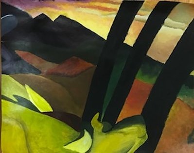
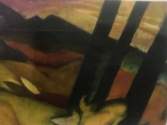
Marc franz- yellow cow
For this project we were given a part of a painting and we were told to use acrylic paints to recreate the piece. I was given the painting done by Marc Franz titled "Yellow Cow".
power point linkhttps://drive.google.com/open?id=0B-yTd0cEqjuiaWJ2UHRydDlEWTg
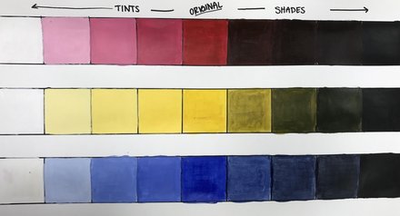 For this practice we were told to make three charts going from tints to shades. I chose the primary colors for this practice. 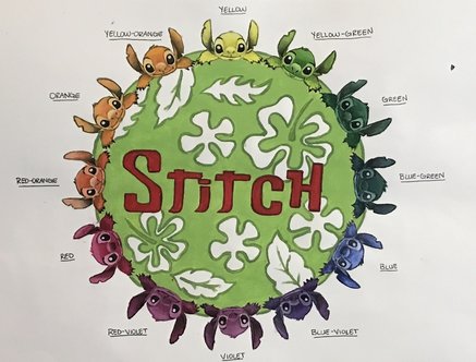 For this activity we were told to be creative and come up with a way to show the color wheel. I chose to repeat stitch in a circle form so that it looks more like a color wheel and then labeled each with the color name. Since the center was going to just be blank, i decided to add stitch's name and add a light green background with a design to contrast with the red of the name.
IN PROGRESS PICTURES:
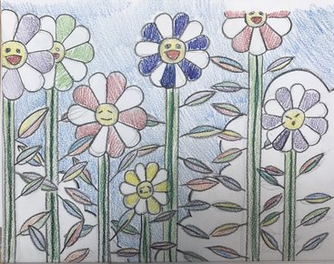
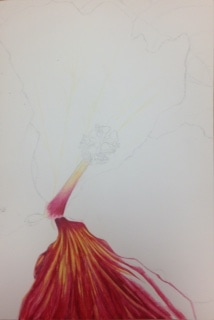
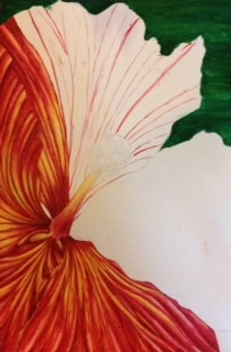
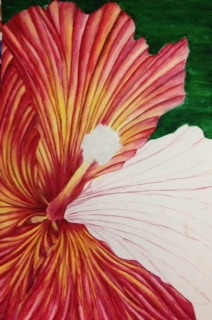
Final Piece  For this piece we were told to find a picture and zoom into the picture to find texture. I chose to do a flower because i really loved the way the flowers looked in Georgia O' Keeffe's pieces. I chose to do my piece in watercolor because i felt that i needed to step out of my comfort zone in always going with prismacolor. I feel like the craftsmanship in this piece could have been better. In some areas i used a little more water than was intended and it ended up peeling the paper in those places. I also feel that in some of the dry brushed areas it needs to be a little more cleaner and maybe blended out a bit more. I think i did good on using a wide range of values to create depth in the places where it folds on each pedal. I tended to use the darker reds and purples in the more shaded areas and yellows and light reds as the main highlights. This piece represents the style of Georgia O’ Keeffe because i chose to use brighter colors than the actual flower was originally. It also represents her style of work, being a zoom in of a flower and getting the texture and bright colors of each pedal. I chose to do my piece in warm colors because I thought that by using these colors it would make it look brighter. I chose to do my background a dark green to contrast the red in the flower since its they are complementary colors. In using the darker green in the background it helped to contrast the yellows and light reds to make it pop more. In this piece, the highlights and shadows played a big role in how it turned out. The highlights and shadows were used to create more depth to each individual pedal on the flower and to make it not look flat. The texture was the main focus of this piece and was the key to the success of this piece. Without the use of texture, the flower would have looked flat. The one difficulty that i kept having to come across was the paper rubbing off because i would accidentally add too much water. I should have payed closer attention to how much water i was using. If I could go back to improve this piece, i would add more highlights. I could possibly go back with white watercolor to lighten up some areas.
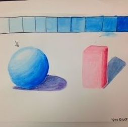
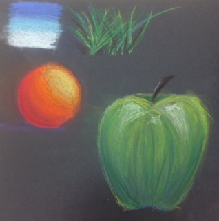 For this practice, we learned how to use chalk pastel. We practiced how to transition colors, blending them together and layering. we also practiced by drawing an apple and adding values there.
color pencil practice
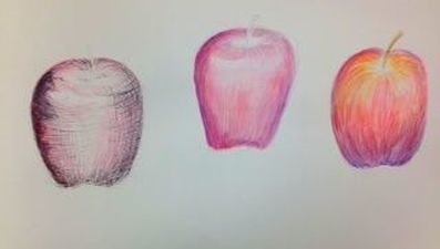
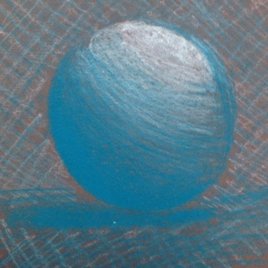
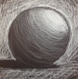
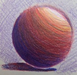
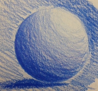
For this practice we had to draw different spheres using different colored paper. For the first one, i chose to draw on brown paper and used a blue and white to create the depth. For the second one i chose to draw on black paper using only white colored pencil so that it contrasts more where the highlights are, compared to the shadows. For the third one i chose to use different colors on a gray paper. I used different colors for this because i thought the end result looked better. I used the cool colors for the shaded area and warmer colors for the highlighted area. For the last one i used only one color on a gray sheet of paper to try and practice pressure. Final color pencil drawing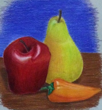 For this minor project i chose to draw an apple, a pear, and a pepper. I chose to do three instead of two because i thought that this way it made a better composition as opposed to just two. I think that overall this piece turned out better than i thought it would. I think that i could have maybe added more darker areas around the pear to give it more dimension as well as a little more on the pepper.
watercolor practice
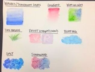
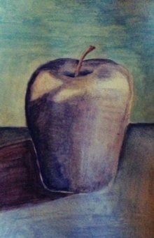
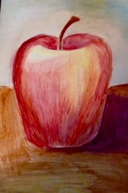
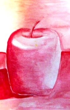
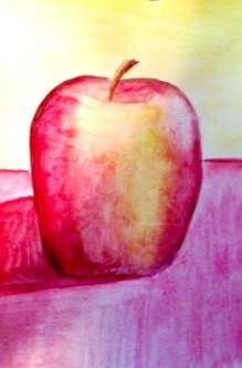
 These were the practices that we did using watercolor. On the first one we learned the different techniques. On the second one we learned how to create values with the watercolor. For the last one we used what we learned and made apples using the techniques.
For this activity we were told to watercolor four different apples using four different techniques that we have learned. For the first one i chose to do an apple only using cool colors. I chose to stick to blues and purples showing the range in values. For the second one i did a choice of color using watercolor pencils. For this i used some purple for the darker areas of the apple blending it with some darker reds. Then i added some yellow and orange as well as some diluted reds on the highlighted areas. For the third one i did monochromatic. The color that i stuck with was red making it lighter on the highlighted areas and darker on the areas where there is shade. For the final apple i chose to do warm colors using the saran wrap technique. In the picture its hard to see the texture that was produced but i wrinkled the saran wrap more in the areas where it became lighter and less on the darker areas.
|
AuthorWrite something about yourself. No need to be fancy, just an overview. ArchivesCategories |
 RSS Feed
