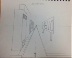
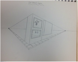
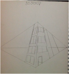
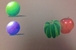
For this project we learned how to draw in perspective. These are some examples of a one point, two point, and three point perspectives of buildings on a street. We also had some practice with prismacolors. 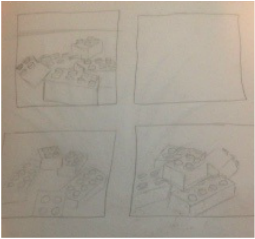 For my final sketch i decided to do legos. I sketched out three different perspectives of legos and then chose the one that i liked out of the three. 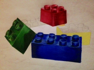 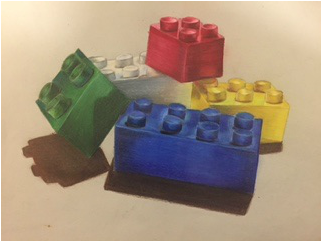 My point of view is interesting because of the way that each individual Lego is facing a different direction. I think that this project is successful in how the legos turned out. I was having a hard time getting the proportions and the overall figure of each Lego but i think now that i have added dimension to each one i feel like that really brought the piece together. For my view it was really important to know and understand perspective drawing because if a line is not how its supposed to be, it butchers the entire look of the Lego. The colored pencil exercises played an important role to this project in helping me decide what colored paper would work best for my color choices. It also helped me get outside of my comfort zone and forcing me to try colored pencils instead of going straight to graphite. The technique that i used in this project was layering colors and blending them out. Because legos tend to have a shiny exterior, i had to incorporate the colors of the legos next to each to show reflection. I think that i was able to show a foreground, middle ground, and a background in the placement of the legos. You can see the blue Lego in the foreground, the green and yellow legos in the middle ground, and the white Lego in the background. Some obstacles that i encountered in this project include being able to really show the reflections of the surrounding legos. Because i dont really have much experience with color i have trouble knowing what colors to add that are not usually seen so i tend to just use different shades of the color being used to create the illusion of depth. An advantage would be being able to layer and blend using prismacolor. I think i have gotten better with using colored pencils and i can see myself doing more drawings in color. I feel like i was well prepared for this project but i feel like we could have spent a little more time on learning what colors can be added to an object that one wouldnt think of adding to make it more realistic.
0 Comments
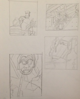
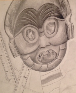
For the final studies I did four different sketches on four different views of the life still. Then I took my favorite sketch out of the four and made a final sketch for it.
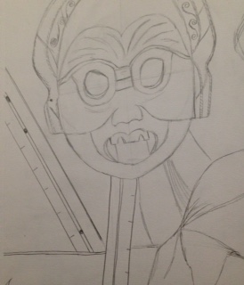
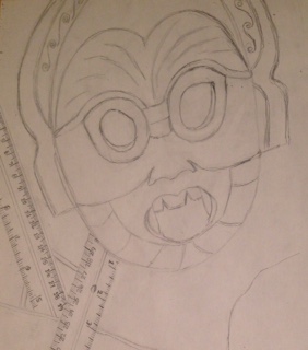
These are some pictures that show the progression of my still life. I started off with the outline and then began on the mask since it was the most detailed. 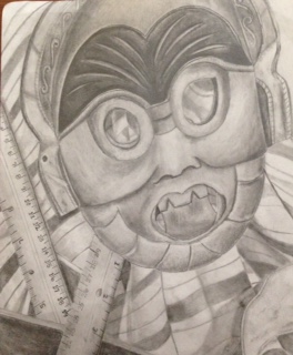 I think my still life drawing looks clean and well blended. In this piece I think my values and shadows make the piece look realistic. I think I used a wide range of values that go from the darkest value to white for the highlights. The values of a piece of work are very important. They help distinguish the shadows and highlights of the piece making it look realistic. The contrast of the white for the highlights and the darker values for the shading create the illusion of depth making it three dimensional. The source of lighting in this piece is from above. Because the light source came from above, there are more highlights in the center of the mask. The compositional sketches played a big role in this piece by helping me decide which view to pick from and it helped with helping me sketch out my final drawing. I think my final drawing is successful in how three dimensional it turned out with the use of shadows around the objects as well as range of values used in the piece. Proportion wise I think I made the mask appear longer than it did and i made the rulers appear larger. Structure wise I think turned out good. I think the items drawn are how they were on the actual still life. The perspective of this piece was seen from a front view angle so that is why the objects are not seen from the sides or tilted. I think that the composition of this overall piece is pleasing since it doesn't overwhelm the eye with a lot of objects. The center of interest would be the mask. I think the mask is well located since it is not right in the middle of the drawing so that the other objects are seen around. I think I could improve on my time management better. I feel like I took most of my time working on the mask and making it look realistic rather than completing it and then going back to add final touches. One challenge that I had to take on was adding darker values. I feel like usually when I work with pencil I tend to use a lot of light and medium values, but because of the darkness of the mask itself, it forced me to use darker values in certain areas. From this drawing I have learned to pay closer attention to the details of objects like texture and values as well as with the proportions of each object.
|
AuthorWrite something about yourself. No need to be fancy, just an overview. Archives
January 2017
Categories |
 RSS Feed
