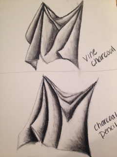
 For this study we had to draw and shade fabric using vine charcoal and charcoal pencil. I found that it is easier to use both vine and the charcoal pencil to create a better value scale since the vine charcoal doesn't go that dark. I also found out that using a white charcoal pencil helps to better show where the light is hitting the fabric. 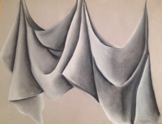 For this final fabric drawing, I think i used a wide range of colors from the value scale. I say this because i tried to use the charcoal pencil where the folds are to make it look darker and then i went back with the vine charcoal to show the gradation to the white where i used the white charcoal pencil to define where the light is hitting. My knowledge to the value practices helped me in this piece by getting a better idea of the value chart. It taught me to go from only using a white background for drawing shadows to learning how to draw using a black background. I think that i did a good job with the transitions from dark to light in showing more than two values and making it look smooth. In the darker spots i used a lot more pressure with the vine charcoal and then going a little darker on the edge with the charcoal pencil. Towards the middle i used less pressure and blended that out. For the highlights i used more pressure with the white charcoal pencil on the outer edges where the light would hit more and then putting less pressure towards the center and fading it out to the lighter gray. The interpretation of texture is essential for this piece in showing the folds of the fabric as well as the smoothness of the sheets. If i were to recreate this piece i would probably go back and darken up some places where the folds meet. I would also make it with more wrinkles on the fabric so that it gets a more realistic look.
0 Comments
Leave a Reply. |
AuthorWrite something about yourself. No need to be fancy, just an overview. Archives
January 2017
Categories |
 RSS Feed
