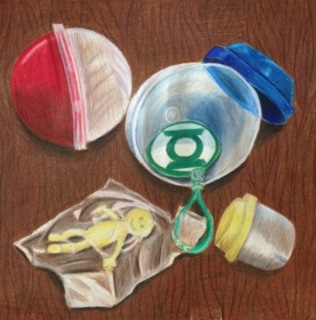
 I think my craftsmanship for this project was okay. I feel like i went too dark too fast so when i added other colors i couldnt get a neat blend since there was already too much wax on the paper. For this piece i decided to use a light tan color for my background. I feel like it was a good choice of background because i was using light yellows and some light browns in this piece so by using this background it helped unify the lighter colors together. Throughout this piece i stuck to using primary colors. I decided to use these colors because it gives a sense of "kids" toys which are usually found in primary colors. I created contrast in this piece by adding dark shadows to each piece. I also did this by adding a dark wood grain to the background to contrast the white of the plastic. I used the texture in the background to enhance the solid textures of the plastic spheres. I used highlights to emphasize the brighter areas where the light hits the plastic. I used shadows in this piece to create depth in each object and also to show the roundness of the toy capsules. Like i previously mentioned i chose a medium dark background so that the objects stick out more and it makes the white in the highlights pop out. It is important to understand prismacolor pencils in knowing which colors to add to make an object pop out (adding purples and blues where you dont expect them). Techniques are also important to know when trying to acquire a successful piece so that you know how to create depth and to show realism. Some difficulties i had in this piece was in the plastic of the smiley toy. I didnt know how to create the plastic so that it looked that the toy was in the bag. I also had trouble blending the interior of the blue capsule since there was so much wax built up on it already. I improved my drawing from what i was told during the critique which was adding darker shadows under the objects as well as adding darker values to the capsules themselves. I could also probably go back and add some more values and thicknesses to the wood grain since they seem to look too thin and not that realistic.
0 Comments
Leave a Reply. |
AuthorWrite something about yourself. No need to be fancy, just an overview. Archives
January 2017
Categories |
 RSS Feed
