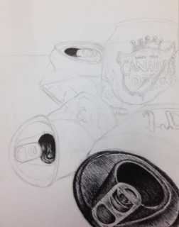
in progress pictures:
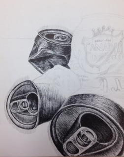
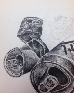
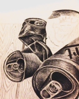
final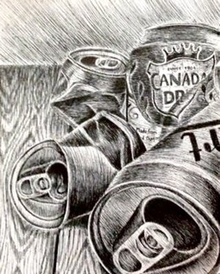 For this project i decided to do a perspective of everyday objects. The perspective i chose was the view of coke cans. The technique that i tried to stick to was hatching. I decided on hatching because the coke cans have a roundness form to them and i wanted them to turn out realistic. I thought that in using hatching i would be able to portray it better. I used perspective in this piece by showing one of the coke cans on the foreground, making it seem bigger, and then having more in the middle ground and background as they are looking smaller in size. The perspective was very important in helping create a good composition. The texture was another important part in this piece in demonstrating the different values, like in the folded parts in the cans. It also shows creates a sense of unity in the piece and minimizes the amount of negative space. The values in any piece of art help to show dimension and to help make it look realistic. I think my craftsmanship was good in this piece but i feel like i should have slowed down and made some parts a little neater. If i could recreate this piece i would definitely lighten up some areas. I feel like i could have used a bit more negative space on the wood so that it didn't look so dark and so that it would contrast more with the bottles. It is important to understand each technique because that way you have a better understanding on where each technique would look best. You also have to understand to keep the lines strait so that it looks neat. I feel like in learning how to use pen and ink i will better my projects in not being afraid to try different techniques. It also helped me to slow down so that i can get details better and to be able to pay closer attention to the values.
0 Comments
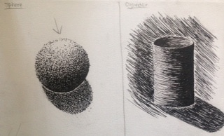
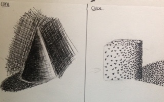
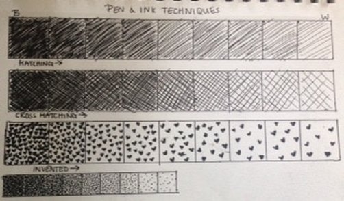 For this practice, we were told to use all the different techniques to create a value scale. These techniques include hatching, cross-hatching, invented, and stippling.
for this part we were told to draw and shade different forms using the techniques we were taught. I decided to add a background to the cylinder and to the cone form to contrast the highlights on each and to make it stand out better.
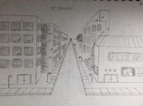
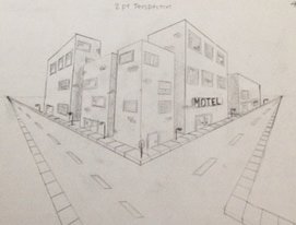
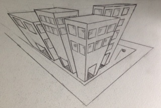
For this part of the assignment we were told to draw three different perspectives of buildings. I think the one that i had the most difficulties on was the three point perspective because it didnt look right when i began to draw it. room corner drawing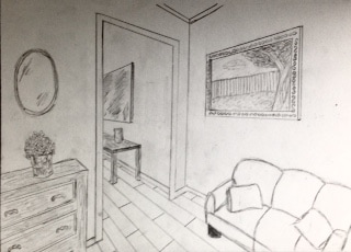 For this assignment we were told to draw a corner of a room to show a two point perspective.
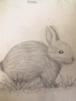
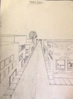
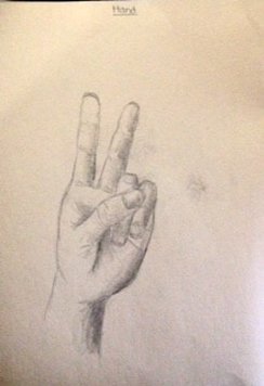
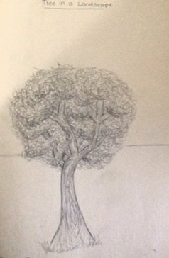
For this first assignment we had to draw an animal, a street scene, a hand, and a tree.
compositional Sketches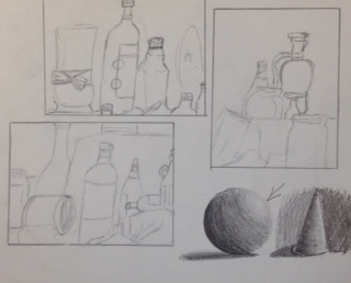 In progress pictures
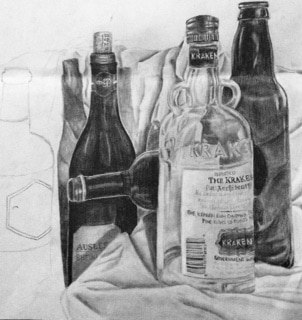
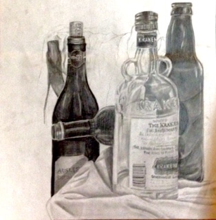
Final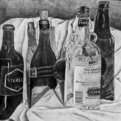 For this project we were told to draw a still life. The composition that I chose for this piece shows a foreground and a background with not a lot of empty space. This part of still life caught my attention because of the range in shapes and sizes of the bottles, making it look more unique. I think that this piece turned out successful, in the way that the range in value and the amount of depth was accomplished to make the bottles and fabric appear more realistic. Space played a big part of this piece, making it all come together and making it look balanced instead of having half of the page empty and white. Texture was another element used to create the illusion of fabric and to show the transparency of the glass bottles. I think that there was a wide range of values used to show the contrast of the bottles to the fabric. In the darker bottles I used a 9b as well as a 4b to get the middle values, and then adding the highlights to the bottles using the white of the paper. For the clear bottle i used a lot more values to show where the bottle behind is showing through as well as to show where the light is being reflected off of. My knowledge from drawing class helped me a lot in this piece. It helped me better understand where i should go darker and where i should be adding more highlights. I think i did a good job in blending throughout this piece to get the values i need. I tend to add more pressure in the darker areas and less pressure in the lighter areas like in the fabric and on the clear bottle. Texture was very essential in making the fabric appear three dimensional and so that it doesn't look flat. If i could have done something differently, it would be to not go too dark too fast. I feel like I have always had trouble with layering and starting off light and working up to the darker areas. I would also maybe clean up some of the areas where it looks like it could need some more blending.
|
AuthorWrite something about yourself. No need to be fancy, just an overview. ArchivesCategories |
 RSS Feed
